Designing the Talent Acquisition module end-to-end
Owning the full UX lifecycle — from user research and journey mapping to wireframing and high-fidelity UI — for the Talent Acquisition module. One of the most complex, two-sided ecosystems within the entire Selamnew platform.
Context
Talent Acquisition is a core pillar of Selamnew Workspace — a homegrown Ethiopian HR SaaS platform supporting over 800 users. The unique challenge of this module was that it had to serve two completely different audiences simultaneously: HR recruiters managing chaotic hiring pipelines, and candidates looking for a smooth, inviting application process. Both of these distinct experiences needed to feel seamless and live within a single, unified product.
Problem
Early on, it became clear that the recruiter and candidate experiences had been thought of as two entirely separate projects. The reality was much trickier. Recruiters needed a high-level, pipeline-shaped view that let them track applicant statuses at a glance. Meanwhile, candidates needed job postings that felt like genuine opportunities, not dry database rows. Our biggest hurdle was designing both sides of this ecosystem without making either one feel like a lazy afterthought.
Approach
Research First: Understanding Both Sides of the Table
Before sketching anything, I ran structured interviews with active HR managers to map out their actual day-to-day workflows. I wanted to pinpoint exactly where they were wasting time on manual effort — which turned out to be shortlisting, constant status updates, and the headache of interview scheduling. On the flip side, I mapped the candidate journey from the moment they discovered a job posting to the final application submission, marking every point of friction or confusion along the way.
Ironing Out User Flows Before Wireframes
Before jumping into Figma, I mapped out the end-to-end user flows for both recruiters and candidates using Miro. Doing this early allowed us to visualize the shared data layer — how job postings connected directly to applicant records. By mapping these connections out visually, we helped the engineering team align on the data architecture and technical constraints before a single pixel was designed.
Two Distinct Interfaces, One Design System
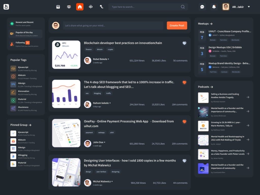
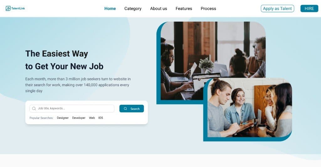
To respect the different needs of our users, we designed two tailored experiences under one cohesive visual umbrella. For Recruiters: a dynamic, pipeline-style dashboard featuring stages as columns, candidate cards packed with inline context, and bulk actions housed in a sticky footer for rapid-fire sorting. For Candidates: a beautifully prioritized job posting page focusing on role clarity, company culture, and a completely frictionless, stripped-back application flow. By leveraging a single component library, we kept the platform's visual identity completely unified without diluting the specific functionality each user group needed.
Mentoring Along the Way
This complex module was also the perfect opportunity to mentor a junior designer on the team. I brought them along through the entire product lifecycle — from synthesizing raw research data to final developer handoff. We co-created the initial wireframes and established a regular design critique cadence. This didn't just sharpen the final UI; it upskilled our design team and set a stronger precedent for how we build future modules.
Outcomes
Reflection
The instinct in two-sided platforms is to find one design language that works for everyone. That instinct is usually wrong. Two clear, opinionated experiences sharing a common design system outperform one neutral experience trying to please both.
Design files
 Open in Figma↗