An onboarding flow that respects the new hire
Optimizing the first journey every new employee takes through the platform — part of a broader UX initiative that drove a 40% increase in overall user engagement.
Context
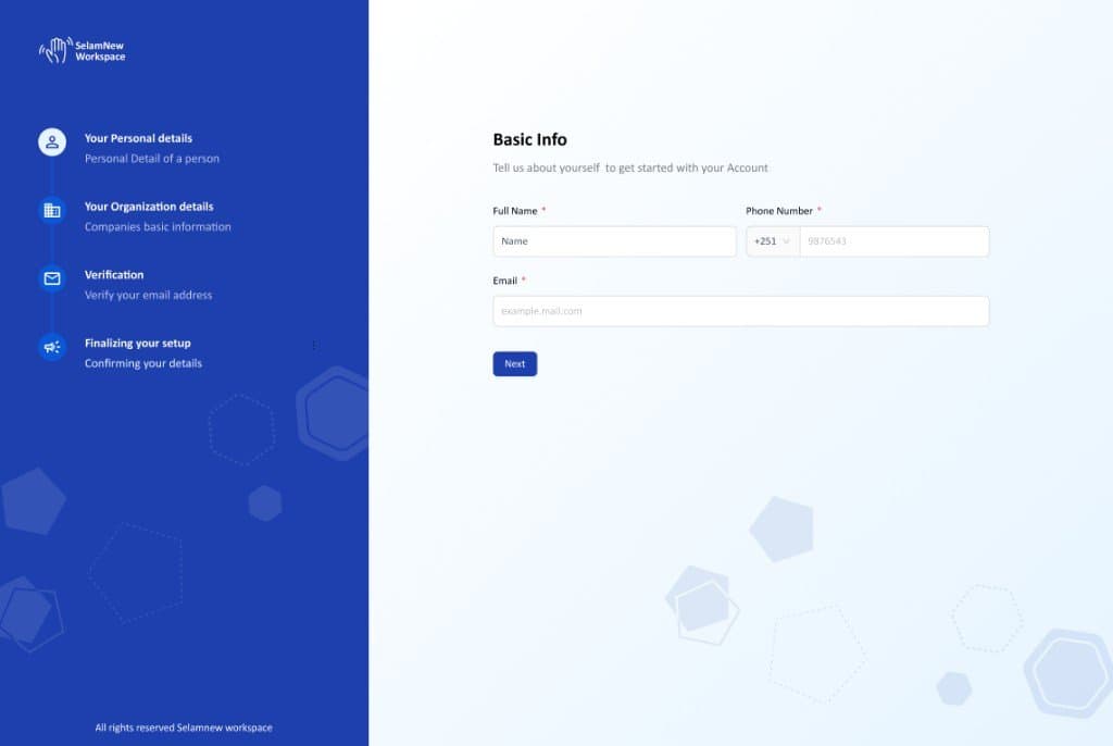
A new hire's very first interaction with company software sets the tone for their entire employee experience. Unfortunately, the original Selamnew onboarding process felt more like an interrogation than a welcome. It was a massive, multi-step wizard with zero visible progress, no explanation for why it needed sensitive data, and absolutely no save state — meaning if a user got interrupted, they had to start completely over. Across a platform with over 800 users, this friction was compounding daily.
Problem
The onboarding flow was technically functional, but experientially hostile. Because the system was so frustrating, HR administrators had to spend their days manually nudging employees just to get them through incomplete profiles. It was the worst possible way to start a working relationship. Our usage audits backed this up, showing a massive drop-off mid-flow, while qualitative feedback from HR managers consistently flagged onboarding as the primary pain point ruining first impressions of the platform.
Approach
Mapping the Journey Before Touching the UI
I started by running journey mapping workshops to align what new hires actually needed to experience with what the backend database demanded. It turned out most of the friction came from asking for context-dependent information before the user even had that context. By reordering the flow around the user's mental model — rather than the backend schema — we eliminated the vast majority of the confusion without needing to change a single data field.
Grouping Fields by Intent, Not Database Tables
Instead of dumping fields on the screen based on how they were organized in the database, I restructured the flow into intuitive, thematic chapters: Who you are · How to reach you · Your role · Your benefits. To build trust, each chapter now kicks off with a simple, one-sentence explanation of why we need this information. The data we're collecting is exactly the same as before, but the experience feels entirely different.
Progressive Disclosure & Smart Defaults
Nobody likes typing things the system should already know. I introduced smart defaults to pre-fill fields that could be inferred from context — like pulling a department based on the assigned manager, currency from the country, or a holiday calendar from the office location. A clean "We pre-filled this based on your location — change if needed" note kept the form transparent while dramatically cutting down completion time.
A Progress System That Tells the Truth
Standard linear progress bars in long forms often create a false sense of momentum, making users feel like they're closer to the finish line than they actually are. I swapped this out for an honest, chapter-based progress indicator. It shows users exactly where they stand, what's coming up next, and a realistic estimate of how long each section will take. We chose radical transparency over false reassurance, and the users thanked us for it.
Outcomes
Reflection
Onboarding is one of the few moments where a SaaS product has the user's full attention. Wasting it with a form that feels like bureaucracy is a kind of malpractice. The smallest emotional cues — a sentence of context, a default that respects the user's time — compound into trust over the lifetime of the product.
Design files
 Open in Figma↗