A landing page that earns the click
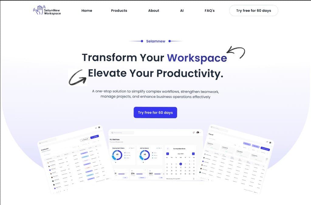
Leading the complete redesign of the Selamnew Workspace marketing landing page — transforming it from a generic, stock-heavy SaaS template into a confident, high-converting product surface. The new design directly drove a 20% lift in user engagement and brought in 200 new users within the first month of launch.
Context
Selamnew Workspace is a homegrown, Ethiopian-built HR SaaS platform with an active base of over 800 users. We are competing directly in a tough market dominated by massive US-based incumbents like BambooHR and Workday. Unfortunately, the original landing page relied heavily on generic stock illustrations and predictable feature grids. It failed to establish credibility with enterprise buyers and did a poor job of communicating the sheer breadth of the platform's eight core modules.
Problem
The landing page needed to achieve three difficult goals simultaneously: signal that Selamnew is a highly secure, enterprise-grade tool; showcase our full suite of modules (including Talent Acquisition, OKRs, Time & Attendance, and Payroll) without overwhelming the visitor; and convert skeptical prospects who were completely new to the brand. The old page did none of this well — engagement was flat, and it read like a weak brochure rather than a powerful product.
Approach
Stripping the Page Back to Its Core Argument
I completely rewrote the page structure to function like a thesis: one bold, undeniable claim above the fold, three clear pieces of evidence right below it, followed by a quiet, confident call to action. Every single content block had to defend its right to be on the screen. By cutting out 40% of the fluff and filler from the original page, the narrative actually became significantly more persuasive.
Designing a Module-Aware Navigation Pattern
With eight distinct modules to show off — spanning everything from Payroll to CFR and OKR Planning — a flat features grid just wasn't going to cut it. Instead, I designed an intuitive, horizontal scroll-snap carousel where each module was given its own micro-narrative card. This allowed visitors to browse the ecosystem seamlessly, exploring it like a premium product line rather than a dry list of tech specifications.
Earning Trust Through Radical Specificity
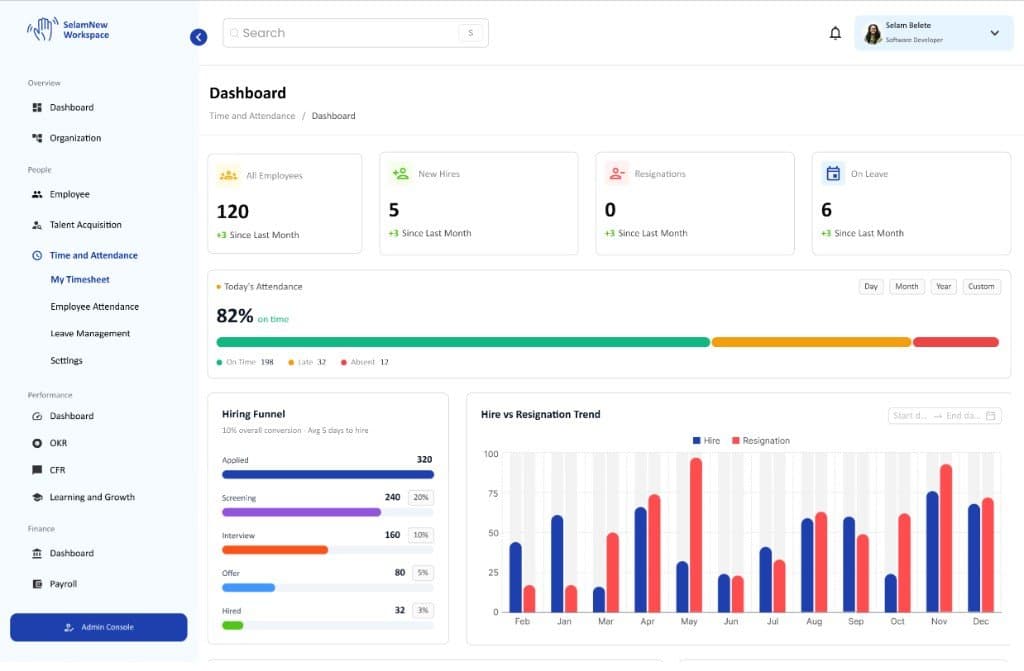
Abstract value propositions don't convert skeptical buyers; proof does. I stripped away the vague taglines and replaced them with crisp, high-fidelity screenshots of the actual product UI alongside concrete usage data from our 800+ user base. Showing the real, working software did more heavy lifting than any copy could. To make sure this fidelity survived the build, I provided the engineering team with a hyper-detailed Figma handoff, including exact component behavior and motion specs, ensuring a flawless launch with zero frontend rework.
Outcomes
Reflection
The original brief simply asked to "make the page look modern." I pushed back and argued that the page didn't need a cosmetic facelift — it needed to make a compelling business case. Reframing the challenge was the real breakthrough. Once the team agreed on what the page was actually trying to say, the layout, motion design, and UI practically wrote themselves.
Design files
 Open in Figma↗