Employee management without the dread
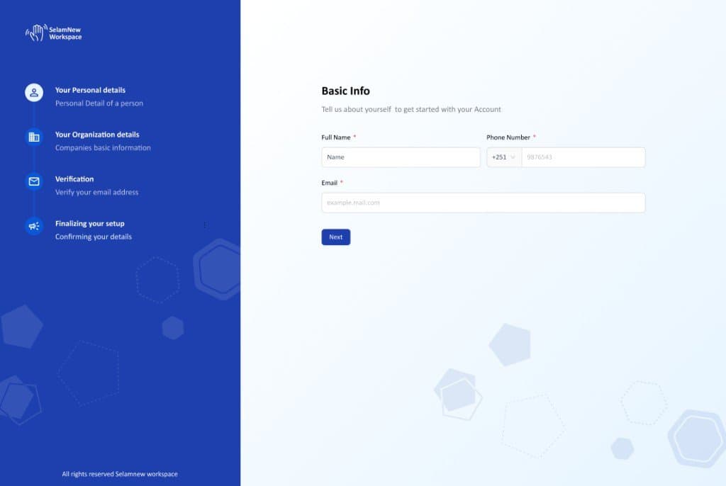
Leading the ground-up redesign of Selamnew's most heavily trafficked surface — transforming over 30 fragmented screens into a cohesive, WCAG 2.1-compliant system. The overhaul drove a 30% boost in overall user satisfaction.
Context
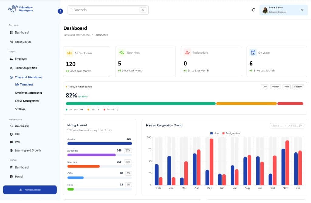
Employee Management is the gravitational center of any HR platform — it is the very first thing HR managers open every morning. However, because Selamnew had scaled incredibly fast with input from multiple hands over time, the experience had become completely fragmented. Across 30+ core screens, styles were mismatched, button patterns were inconsistent, font hierarchies were broken, and mobile layouts were nonexistent. To make matters worse, there were severe dark/light mode conflicts and massive accessibility gaps.
Problem
Our design system had essentially buckled under the weight of rapid product delivery. HR managers were left navigating an experience that felt disjointed and unfinished. For instance, the CFR (Conversations, Feedback & Recognition) module felt visually alienated from the Compensation & Benefits panel. Filters were buried, and individual profile views were just massive walls of input fields with zero visual hierarchy. It got to the point where power users were actively building workarounds outside the platform just to avoid using it.
Approach
Rebuilding the Foundation First
Before I touched a single product screen, I went straight to the component library. I established a bulletproof source of truth for our basic building blocks — buttons, form fields, data tables, and status badges. Crucially, every interactive element was rebuilt from scratch to meet WCAG 2.1 AA accessibility standards, ensuring proper focus states and semantic structures. Getting these foundations stable meant that the subsequent redesign of all 30+ screens practically fell into place consistently.
Turning the Profile into a Dynamic Workspace
Instead of forcing users to look at a flat, overwhelming form with 60 open fields, I redesigned the employee profile into a structured, lifecycle-driven workspace. It now flows logically: Identity → Role → Compensation → Growth. Each section is cleanly collapsible, and edits happen inline. I also pulled the CFR module and Compensation panels directly into this view so managers could take action without constantly losing their place or context mid-task.
High-Spec Figma Handoffs
To make sure nothing got lost in translation, I delivered every single view with comprehensive specifications, annotated component behavior, and clean Figma Dev Mode setups. Giving the engineering team exact blueprints eliminated the typical guesswork that happens during handoff. This intentional up-front investment drastically reduced design-related QA rework and allowed us to ship the entire overhaul ahead of pace.
Elevating Mobile to First-Class Status
The desktop platform previously had no responsive counterparts. I designed dedicated mobile and responsive variants for every single core surface — including the directory, profile views, and quick approval flows. Now, HR managers can approve requests or look up employee details on the move without a degraded or broken experience.
Outcomes
Reflection
The constant temptation in enterprise design is to add — every stakeholder has a niche feature they want pinned to the top. The harder, more rewarding work is being an editor. It's about deciding what truly deserves prime real estate and trusting that a clean layout will make everything else effortlessly findable. The final version actually has fewer visual distractions than the old system, yet it does far more heavy lifting.
Design files
 Open in Figma↗